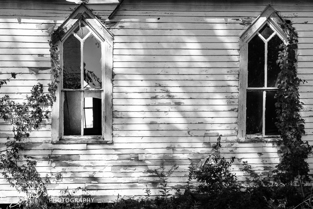
I would lose the roof, just another set of shadows to deal with I do so like the one without the roof
I like it without the roof. The photo is pulling you into the building without the roof.
The building without the roof calls attention to the graphics of the shot. Pure horizontals broken by verticals. This graphic approach shows us the design and unique quality to the light which is revealed in the texture. The shadows – a seemingly random set of shapes play over the underlying graphic much as a melody over an ostinato. The roof offers nothing of value… no design, no texture, no graphical interplay.
All that said, the slight skewing of the image lessens the appeal of the graphics. The lens is slightly turned from a complete oblique presentation and the building (design) ever so slowly skews off to the right. For me it is a deal killer.
Thanks for the critique Don! I’ll have to see if I can do some perspective corrections in photoshop. I’ve been worried about being too documentary and square to the subjects. Guess I’ll need to think a little more on site as I’m shooting!
i like it without the roof.
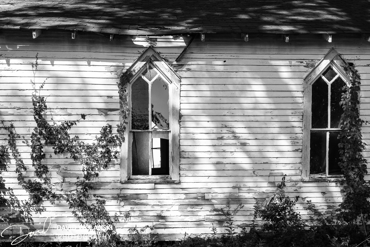
I would lose the roof, just another set of shadows to deal with I do so like the one without the roof
I like it without the roof. The photo is pulling you into the building without the roof.
The building without the roof calls attention to the graphics of the shot. Pure horizontals broken by verticals. This graphic approach shows us the design and unique quality to the light which is revealed in the texture. The shadows – a seemingly random set of shapes play over the underlying graphic much as a melody over an ostinato. The roof offers nothing of value… no design, no texture, no graphical interplay.
All that said, the slight skewing of the image lessens the appeal of the graphics. The lens is slightly turned from a complete oblique presentation and the building (design) ever so slowly skews off to the right. For me it is a deal killer.
Thanks for the critique Don! I’ll have to see if I can do some perspective corrections in photoshop. I’ve been worried about being too documentary and square to the subjects. Guess I’ll need to think a little more on site as I’m shooting!
Thanks for the comments folks!